People are arriving, and almost none of them are getting in touch. That's frustrating, but it's also the easier problem to fix, because the visitors are already there. These are the seven things that most often stop them.
By RankNovo Editorial Team
5 min read
Key takeaways
If you already have visitors, fix conversion before buying more traffic.
Every key page should say what you do, who it's for and where, with one clear next step.
Short forms, tap-to-call numbers and real proof next to the button win more enquiries.
Test your forms today: many "no leads" problems are enquiries landing in spam or going unanswered.
What is a small improvement worth?
Put in your own numbers.
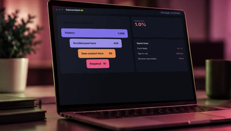
Here's the good news first. If you have visitors but no leads, you don't need more traffic. Buying more of it just pours more people into the same leaky page. The job is to find where people drop out and make the next step obvious, easy and believable. Most sites lose people for the same handful of reasons.
1. Visitors can't tell what you do in five seconds
People decide fast. They land on your page, glance at the top, and either understand what you offer and who it's for, or they leave. A headline like "Welcome to our website" or "Excellence in everything we do" tells them nothing. Neither does a stock photo of people shaking hands.
How to fix it
Make the top of your homepage and every service page answer three things straight away: what you do, who it's for, and where. "Emergency boiler repair in Leeds, same-day visits" does the job. Show a real photo of your work or your team instead of a stock image, and put your main button right there.
2. There's no clear next step
Many sites list services and then just stop. The visitor reads, thinks "okay", and goes off to do something else. Others offer five different buttons (call, email, chat, download, subscribe) and the visitor picks none.
How to fix it
Decide the one action you want on each page and make it obvious. Use buttons that say what happens: "Get a free quote", "Book a call", "Check availability", rather than "Submit" or "Learn more". Repeat the button near the top, in the middle and at the end of long pages. Keep a secondary option, like a phone number, but give it less emphasis.
3. Contacting you is harder than it should be
Every extra field on a form loses people. Asking for a company name, budget, address, a long message, and a phone number before anyone has spoken to you is a lot to ask from a stranger. On mobile, a phone number that isn't tappable, or a form that's tiny and awkward, loses even more.
How to fix it
Cut the form down to what you genuinely need to reply, usually name, email or phone, and a short message. Make the phone number a tap-to-call link and put it in the header. Test the form on your own phone. If it's annoying for you, it's worse for a stranger.
4. Nothing gives people a reason to trust you
A stranger has to believe you're real, competent and safe to contact. If your site has no reviews, no photos of actual work, no names, no address and no sign that other customers have used you, that's a big leap. Trust is usually the deciding factor for services people can't judge in advance.
How to fix it
Add real proof near your buttons. Show genuine customer reviews with names, a few before-and-after photos, certifications or accreditations you actually hold, and your real address and phone number. Say clearly how things work, including pricing where you can, and what happens after someone gets in touch. Never invent testimonials or numbers. Visitors and search engines both notice.
5. You're attracting the wrong visitors
High traffic doesn't help if it's the wrong crowd. A page that ranks for "free website templates" brings in people who want free templates. Ads that aren't tightly targeted can send people who were never going to buy.
How to fix it
Look in Google Analytics and Search Console at which pages and searches bring visitors, and compare them with the pages that produce enquiries. If your busiest pages bring in people who aren't buyers, shift your effort towards pages and searches that match what you sell. For ads, check the search terms report and block irrelevant ones.
6. The site is slow or breaks on mobile
People are impatient, and on a phone they're even more so. A page that takes several seconds to appear, jumps around as it loads, or shows a form that doesn't fit the screen loses visitors before they've read a word.
How to fix it
Test your key pages in Google's PageSpeed Insights, and then on a real phone using mobile data. Compress images, remove unused plugins and scripts, and make sure the button and form are usable with one thumb. Fixing speed often lifts enquiries without touching a word of copy.
7. Leads are arriving, and you're losing them
This one catches many owners out. Sometimes the site works fine, but form messages land in a spam folder, the notification goes to an old email address, a broken form fails silently, or enquiries arrive and nobody replies for days. By the time you answer, the person has already contacted someone else.
How to fix it
Test every form yourself today. Submit it from your phone, then check the email arrives in the right inbox and not in spam. Set up an automatic reply that confirms the message was received. Decide who answers enquiries and how quickly. Replying fast, ideally the same day and better still within the hour for urgent services, gives you a real edge over slower competitors. Count phone calls too. If you don't track them, you may be getting more leads than you think.
How to find where people are dropping off
You don't have to guess. Free tools like Microsoft Clarity show recordings of real visits and heatmaps of where people click and stop scrolling. Watch ten or twenty recordings and patterns appear quickly: people ignoring your button, tapping things that aren't links, or leaving at the same point. Set up conversion tracking in Google Analytics for form submissions and calls, so you can see which pages and sources produce leads.
How to test changes properly
Change one thing at a time, and give it enough visitors and time to judge. If you rewrite the headline, shorten the form and swap the photos all in one go, you won't know which helped. A small site may need a few weeks to see a clear difference. Keep a simple note of what you changed and when.
What to do this week
Test your forms and phone link on your phone. Rewrite the top of your homepage so a stranger gets it in five seconds. Make one button the clear priority on each key page. Add real proof next to it. Then watch what happens over the next month. Those four steps fix the problem for many sites.
Frequently asked questions
It varies a lot by industry, price and traffic source, so compare yourself with your own past results rather than a single benchmark. Aim to improve month on month.
Usually conversion first. Improving how many visitors get in touch makes any extra traffic more valuable.
Not always. Often a few targeted changes to your main pages do more than a full rebuild. A rebuild makes sense if the site is slow, outdated, or can't be edited.
Simple fixes like forms and calls to action can show results within weeks. Bigger changes take longer to measure.
Free website audit
Get your free conversion review
Tell us where to look. A RankNovo strategist reviews your site and replies within 24 hours with what's holding you back and what to fix first. No contract, no pressure.
A 15-point review of your rankings, site speed, AI search visibility and quick wins, delivered to your inbox within 24 hours.
We value your privacy. We use cookies to understand how visitors use our site and to improve our marketing. You can accept or reject them; the site works either way. Privacy Policy